In the rapidly evolving digital landscape, ensuring your website looks great on any device is more critical than ever. Responsive web design is not just a trend; it's a necessity. As an established Creative Director and brand marketing expert, I've witnessed the transformative impact of responsive design on user experience and business outcomes. In this blog, we will explore practical tips and strategies to create responsive websites that provide seamless experiences across all devices.
Responsive web design (RWD) is an approach that ensures websites adapt to various screen sizes and devices. It involves using flexible layouts, grids, images, and CSS media queries to create a seamless user experience, whether viewed on a desktop, tablet, or smartphone.
Key Principles:
A responsive design ensures that users have a consistent and enjoyable experience, regardless of the device they use. This leads to higher engagement, longer visit durations, and reduced bounce rates.
Search engines like Google prioritize mobile-friendly websites in their rankings. A responsive design improves your SEO efforts by ensuring your site meets these criteria, driving more organic traffic.
With the increasing diversity of devices, responsive design future-proofs your website, ensuring it remains functional and visually appealing across emerging technologies.

Designing for mobile first ensures that the most critical elements of your website are prioritized. It’s easier to scale up a design for larger screens than to shrink it down.
Benefits of Mobile-First Design:
Implement a flexible grid system using CSS Grid or Flexbox. These tools allow you to create responsive layouts that adjust based on screen size.
Best Practices:
Images and media are crucial components of web design. Ensure they are optimized for responsiveness to maintain visual appeal and performance.
Techniques for Image Optimization:
Media queries are the backbone of responsive design, allowing you to apply specific styles based on device characteristics.
Common Media Queries:
With the prevalence of touch devices, it’s essential to optimize your design for touch interactions.
Tips for Touchscreen Optimization:
Testing your design across multiple devices and browsers is crucial to ensure a consistent experience.
Testing Tools:
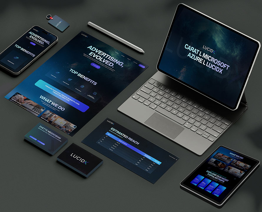
To illustrate the power of responsive web design, let's look at the case of LucidX, a marketing tech startup we partnered with at Lucent Marketing.
Objective: Create a visually stunning and responsive website that reflects LucidX's innovative spirit and caters to a diverse audience.
Approach:
Outcome: The responsive design resulted in a significant increase in mobile traffic and user engagement. The seamless experience across devices reinforced LucidX’s brand identity as a forward-thinking and user-centric company.
Leverage advanced CSS techniques like CSS Grid, Flexbox, and custom properties to create more complex and flexible designs.
Examples:
Progressive enhancement ensures that your website is functional on all browsers, with enhanced features for those that support them.
Steps for Progressive Enhancement:
Performance is crucial for user experience and SEO. Optimize your design and assets to ensure fast load times.
Performance Optimization Tips:
Responsive web design is a critical component of modern web development. By following these tips and best practices, you can create websites that provide a seamless and engaging experience across all devices. At Lucent Marketing, we’ve seen the transformative power of responsive design in driving user engagement and business success. Remember, the key to effective responsive design is to prioritize the user experience, optimize performance, and continually test and iterate to ensure your website remains accessible and visually appealing on any device.
